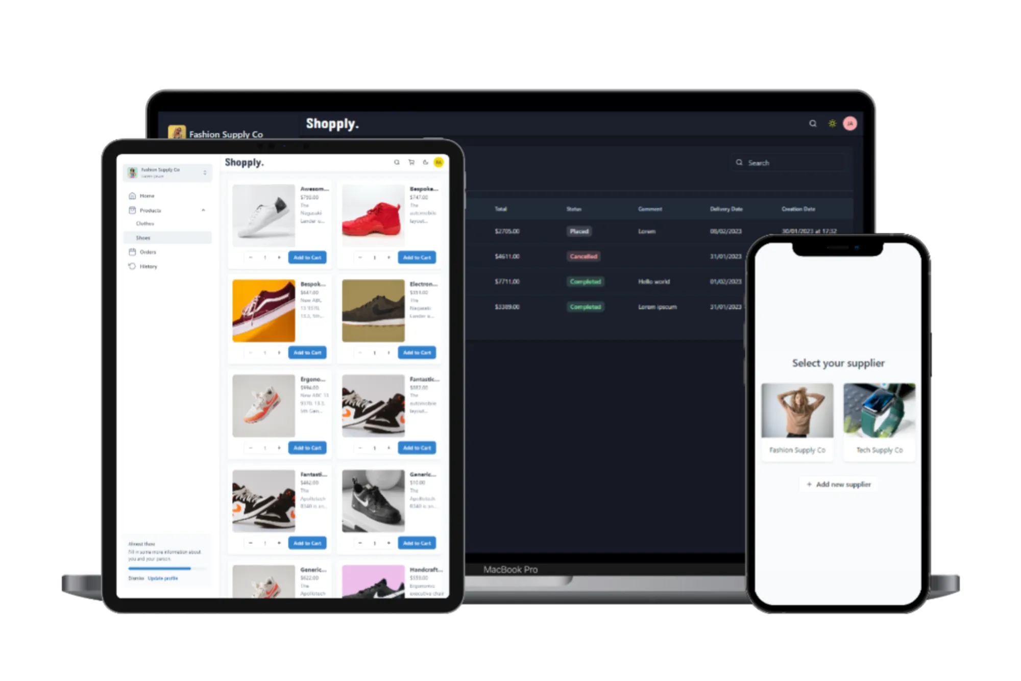
In today’s digital age, mobile devices have become an integral part of our daily lives. From browsing the internet to shopping online, people rely heavily on their smartphones and tablets to access information and services. As a result, ensuring that your website is optimized for mobile users is paramount to success in the online space. In this comprehensive guide, we’ll explore how you can leverage Next.js, a powerful React framework, to create a mobile-responsive website that caters to the needs of modern users. From understanding the basics of Next.js to implementing advanced mobile optimization techniques, this article will equip you with the knowledge and tools necessary to thrive in the mobile-first world.
Understanding Next.js
Before we delve into mobile responsiveness, let’s take a moment to understand what Next.js is and why it has gained widespread popularity among developers. Next.js is a React framework that provides a robust set of tools and functionalities for building server-side rendered (SSR) and statically generated web applications. Unlike traditional React applications, which rely solely on client-side rendering, Next.js offers server-side rendering out of the box, resulting in faster page loads and improved performance.
Additionally, Next.js comes with features such as automatic code splitting, route pre-fetching, and built-in CSS and Sass support, making it an ideal choice for building complex and dynamic web applications. Its simplicity, flexibility, and performance have made Next.js the go-to framework for developers looking to build modern, scalable web applications.
Why Mobile Responsiveness Matters
With the proliferation of mobile devices, more and more users are accessing websites on smartphones and tablets. In fact, mobile traffic has surpassed desktop traffic, making it imperative for businesses to prioritize mobile optimization. A mobile-responsive website not only provides a better user experience but also improves search engine rankings and conversion rates.
Failure to optimize your website for mobile devices can result in high bounce rates, decreased engagement, and lost revenue opportunities. By ensuring that your Next.js website is mobile-responsive, you can reach a wider audience, enhance user satisfaction, and stay ahead of the competition.
Best Practices for Mobile Responsiveness in Next.js
Now that we understand the importance of mobile responsiveness, let’s explore some best practices for optimizing your Next.js website for mobile devices:
Responsive Design
The foundation of mobile responsiveness is a responsive design. With Next.js, you can create fluid and adaptive layouts using CSS media queries and flexbox. Design your website in a way that allows content to adapt seamlessly to different screen sizes and orientations, ensuring a consistent and intuitive user experience across devices.
Fluid Layouts
Instead of fixed-width layouts, use fluid layouts that expand and contract based on the user’s screen size. This ensures that your website looks great on devices of all sizes, from smartphones to large desktop monitors. Next.js provides built-in support for CSS Grid and Flexbox, making it easy to create flexible and responsive designs without relying on third-party libraries.
Optimize Images and Media
Large images and media files can significantly impact page load times on mobile devices. To ensure fast loading times and smooth performance, optimize your images and media files for the web. Use formats like WebP and JPEG XR, which offer better compression and quality compared to traditional formats like JPEG and PNG. Additionally, leverage Next.js’s image optimization capabilities to automatically resize and compress images based on the user’s device and screen resolution.
Prioritize Content
On mobile devices, screen real estate is limited, so it’s essential to prioritize content strategically. Place important information, calls to action, and interactive elements within easy reach of the user’s thumb to minimize scrolling and maximize engagement. Consider using progressive disclosure techniques to present content in a layered and hierarchical manner, allowing users to access additional information as needed without overwhelming them with too much content upfront.
Test Across Devices and Browsers
Testing is crucial to ensure that your Next.js next mobile ajman website looks and performs as intended across a wide range of devices, browsers, and screen sizes. Use tools like Google’s Mobile-Friendly Test, BrowserStack, and Device Mode in Chrome Developer Tools to simulate different devices and identify any issues that need to be addressed. Pay special attention to touch interactions, navigation menus, form fields, and other interactive elements to ensure a seamless user experience on mobile devices.
Mobile responsiveness is no longer optional but essential for success in today’s mobile-first world. By optimizing your Next.js website for mobile devices, you can improve user satisfaction, increase engagement, and drive conversions. Follow the best practices outlined in this guide, experiment with different techniques, and iterate based on user feedback to create a mobile-responsive website that delights users and delivers results. Next Mobile Ajman.


